Posted on — Leave a comment

How to Prepare Print-Ready Artwork: Bleed, CMYK & Resolution Explained

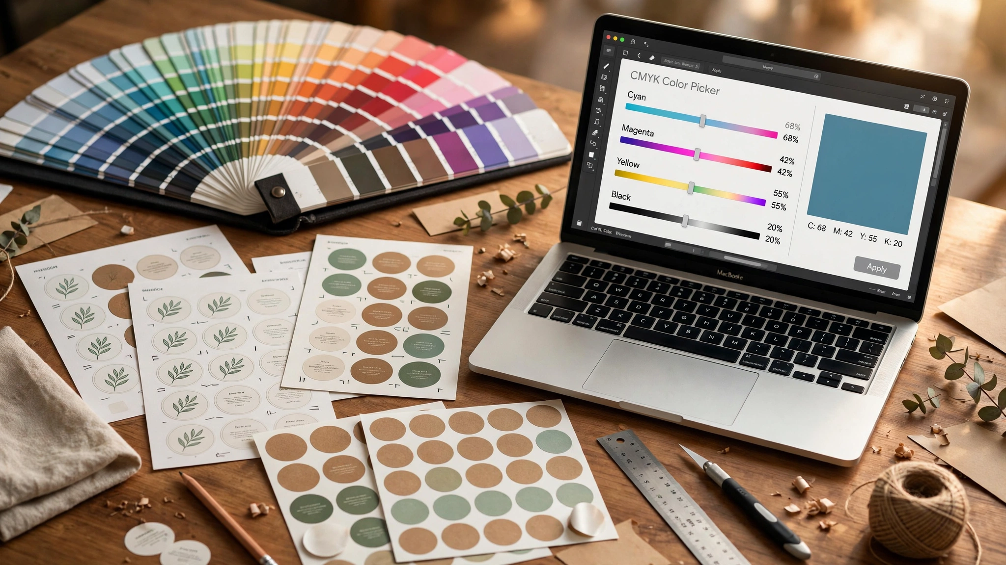
Designer desk with printed label proofs, color swatch book, and CMYK color picker on a laptop

Here’s an uncomfortable stat from behind the scenes of every print shop: most label reprints have nothing to do with the printer. They happen because the artwork file wasn’t set up right — colors that looked neon on screen come back dull, text gets clipped at the edge, or a low-resolution logo prints looking like a blurry mess.

The painful part? Every one of these problems is preventable, and none of them require design skills to fix. You just need to know what “print-ready” actually means.

This guide is written for the non-designer: the candle maker, the coffee roaster, the skincare founder who has a logo and wants labels that come back looking exactly like what they imagined. Five things to check, in plain English.

The 30-Second Print-Ready Checklist

If you only remember one thing from this article, remember this: a print-ready file has

  1. Bleed — your artwork extends 3 mm (1/8″) past the cut edge on every side
  2. CMYK color mode — not RGB
  3. 300 DPI resolution — at the final printed size
  4. Fonts converted to outlines (or fonts included)
  5. A dieline layer if the label is die-cut or kiss-cut

Get these five right and 95% of artwork problems disappear. Below, each one explained — and exactly how to check it.

1. Bleed: Give Your Artwork Some Breathing Room

Bleed is extra artwork that extends past where the label will be cut. Think of it like painting a wall — you paint past the edge of the tape so there’s no unpainted strip showing when the tape comes off.

When labels are printed, they’re cut from large sheets. The cutting blade can shift by a fraction of a millimeter. Without bleed, that tiny shift exposes a hairline strip of unprinted white along the edge of your label. With bleed, the blade cuts through printed artwork either way, and the edge looks clean.

The standard: 3 mm (0.125″) of bleed on every side. So a 50 × 50 mm label should be set up as a 56 × 56 mm file, with the extra 3 mm on each side containing your background color or pattern extended outward.

Two zones you should know about:

  • Trim line — where the blade actually cuts (your intended label edge)
  • Safe zone — keep all important text and logos at least 3 mm inside the trim line, because the same tiny cut shift can otherwise nip the edge of your text
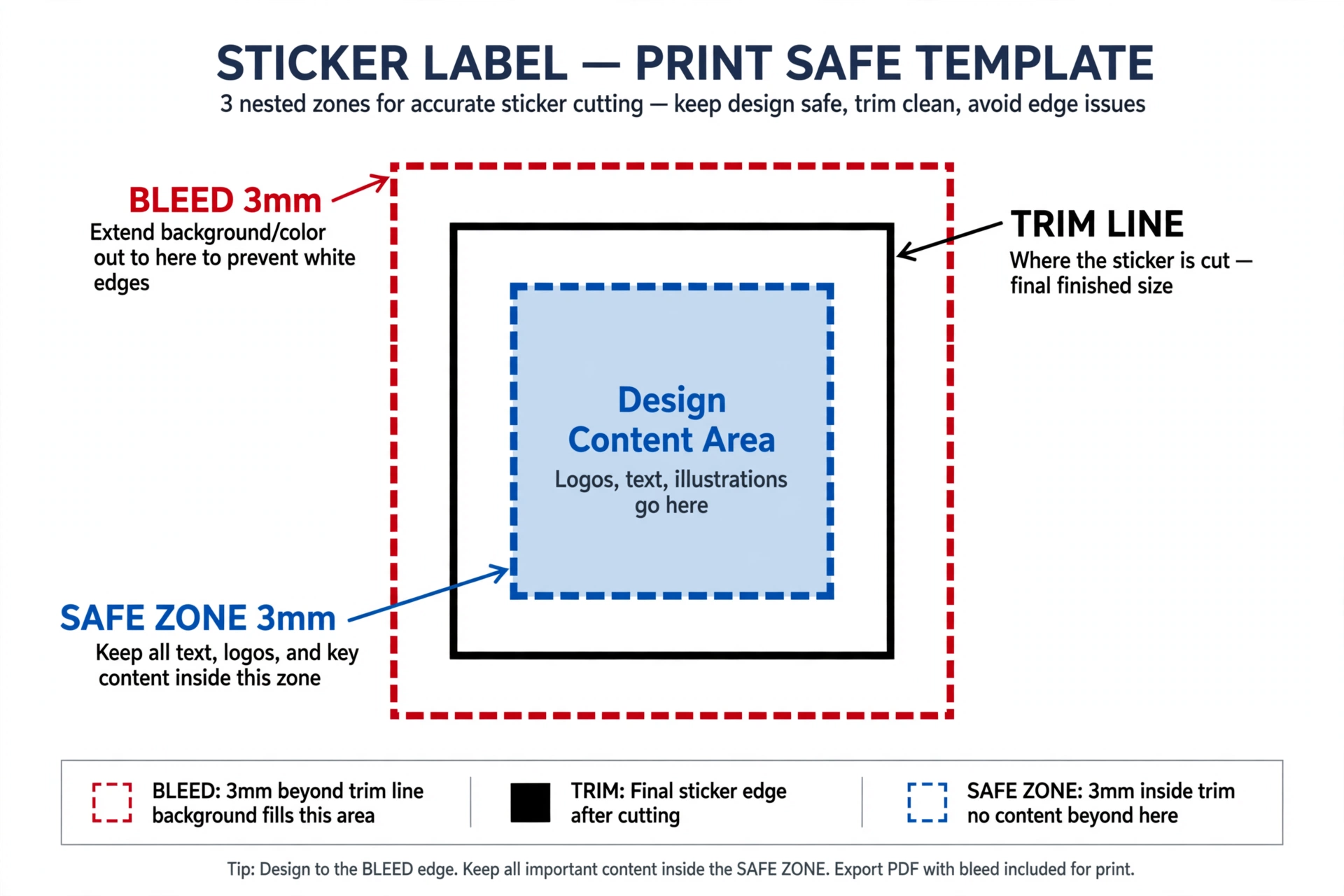
Bleed diagram: trim line, 3mm bleed, and safe zone on a label

One common mistake: exporting a file where the background stops exactly at the trim line. On screen it looks perfect. In print, it leaves white slivers. Always extend backgrounds, photos, and color fills into the bleed.

2. CMYK vs. RGB: Why Your Colors Look Different in Print

This is the single biggest source of “but it looked different on my screen” complaints, so let’s get it straight.

  • RGB (Red, Green, Blue) is how screens make color — with light. Your phone and monitor can produce extremely vivid, glowing colors because they’re emitting light.
  • CMYK (Cyan, Magenta, Yellow, Black) is how printers make color — with ink on paper. Ink absorbs light, so the color range (gamut) is smaller and less luminous.

When you design in RGB and the printer converts to CMYK automatically, bright neons and electric blues dull down — sometimes dramatically. That gorgeous Instagram-purple logo prints as a flat, muted violet. This isn’t a printer error; it’s physics.

What to do: set your document to CMYK before you start designing, not after. In Illustrator, InDesign, or Photoshop, this is one setting when you create the file. If your file is already RGB, convert it and then look at it — adjust any colors that went muddy before sending.

Two practical tips:

  • Blacks matter. For rich black areas (not small text), use “rich black” (e.g., C60 M40 Y40 K100) instead of pure K100, which can look washed out on labels.
  • Proofs are your friend. We send a free digital proof before production for exactly this reason — it’s your chance to catch a color shift on screen before ink hits material.
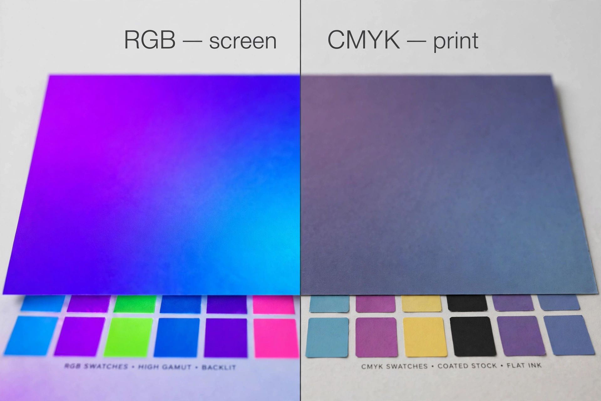
Side-by-side comparison: RGB neon colors vs their CMYK printed equivalents

3. Resolution: 300 DPI at Final Size

DPI (dots per inch) measures how much detail is packed into your image. Screens display at ~72 DPI and look fine. Printers need much more — 300 DPI at the final printed size is the standard.

The classic failure: a founder screenshots their logo from their website (72 DPI, tiny) and stretches it to fit a 4-inch label. On screen it still looks okay-ish. Printed, every pixel becomes visible and the logo looks soft and blocky.

The math is simple: a 3 × 3 inch label at 300 DPI needs an image that’s 900 × 900 pixels. Check yours: image width in pixels ÷ printed width in inches ≥ 300.

Vector beats raster, always. Vector artwork (AI, EPS, PDF with vectors, SVG) is made of math, not pixels — it scales to any size with zero quality loss. Your logo should ideally exist as a vector file. Raster images (JPG, PNG, TIFF) are pixel grids and can’t be safely enlarged beyond their 300-DPI limit.

If you only have a JPG logo: send the largest version you have, don’t upscale it yourself (upscaling software guesses pixels; it doesn’t add real detail), and ask us — small logos can often be cleanly redrawn as vectors.

4. Fonts: Convert to Outlines

Here’s a scenario that ruins print runs: you send your file, the printer’s computer doesn’t have your exact font installed, and their software silently substitutes a lookalike. Your carefully chosen typography comes back… wrong.

The fix takes ten seconds: convert text to outlines (Illustrator: Type → Create Outlines; InDesign: Type → Create Outlines) before exporting. This turns your letters into vector shapes that look identical on any computer, font installed or not.

Two rules:

  1. Keep an editable copy of your file before outlining (outlined text can’t be re-typed).
  2. If you can’t outline for some reason, include the actual font files with your artwork — never assume we have them.

5. Dielines for Die-Cut and Kiss-Cut Labels

If your labels are cut to a custom shape — die cut or kiss cut — the printer needs a dieline: a separate layer in your file that marks exactly where the blade cuts, usually drawn as a spot-color line labeled “Dieline” or “CutContour.”

The dieline is not part of your design; it’s an instruction to the cutting machine. Common mistakes:

  • Forgetting the dieline entirely and sending just the artwork
  • Drawing the dieline on the same layer as the artwork (it may print as a visible line — bad)
  • Making the cut path too intricate: blade cutting has physical limits, so extremely fine details, sharp inside corners, and hairline bridges can tear or fail. If in doubt, send the design and ask — we review dielines in the free proof

6. File Formats, Ranked

Not all files are equal in a print workflow. Send from the top of this list if you can:

  1. PDF (press quality) — the universal standard. Embeds fonts and images, preserves vectors and CMYK. Always the best choice.
  2. AI / EPS — native vector files. Great, as long as fonts are outlined and it’s saved with compatibility on.
  3. PSD — fine if it’s 300 DPI, CMYK, with bleed, and flattened or with fonts rasterized.
  4. PNG / JPG / TIFF — acceptable only if 300 DPI at final size, CMYK, with bleed included. A 72-DPI web PNG is not print-ready no matter what it’s saved as.

What never works: Word documents, PowerPoint slides, Canva links (export the PDF, don’t share the link), screenshots, and images pulled from social media. If your logo only exists as an Instagram profile picture, tell us upfront — redrawing is cheaper than reprinting.

7. Special Cases: White Ink and Clear Materials

One more thing that surprises first-time label buyers: standard printers don’t print white. On clear BOPP or transparent labels (see our material guide), any “white” area of your design is actually just… the product showing through.

If your design needs white — white text on a dark bottle, a white logo on a clear label — that requires a white ink layer, which is a separate spot-color pass (usually specified as a spot channel named “White”). Tell your printer which areas need white ink when you request the quote; it affects pricing and the proof will show it as a separate layer.

The 7 Most Common Artwork Mistakes (Quick Scan)

Before you hit send on any label artwork, run through this list:

  1. ❌ RGB color mode → ✅ Convert to CMYK
  2. ❌ 72-DPI web image stretched to print size → ✅ 300 DPI at final size (or vector)
  3. ❌ No bleed → ✅ 3 mm bleed on all sides
  4. ❌ Text touching the edge → ✅ Keep text 3 mm inside the trim line
  5. ❌ Live (non-outlined) fonts → ✅ Convert to outlines
  6. ❌ Dieline missing or on the artwork layer → ✅ Separate spot-color dieline layer
  7. ❌ Screenshot / social media image as “the logo” → ✅ Original high-res or vector file

What If Your File Isn’t Ready? Don’t Guess.

Here’s the thing most printers won’t tell you: you don’t need a perfect file to get a quote. Send what you have — the Canva export, the JPG logo, the rough idea sketched on paper — and a real printer will tell you exactly what needs fixing.

At ZORVOO, every order gets a free digital proof before production, and our prepress check catches bleed, resolution, and color-mode problems before they become expensive mistakes. We’d rather spend ten minutes fixing your file than have you pay for a reprint.

Request a custom quote → — attach your artwork, tell us the size and quantity, and we’ll review the file and send pricing within 24 hours. If something in your file needs work, we’ll show you exactly what and how to fix it. No charge, no commitment.


Related reading: Die Cut vs. Kiss Cut Stickers: Which Is Right for Your Brand? · Vinyl vs. BOPP vs. Paper: How to Choose the Right Label Material · Custom Waterproof Product Labels
Posted on — Leave a comment

Vinyl vs. BOPP vs. Paper: How to Choose the Right Label Material

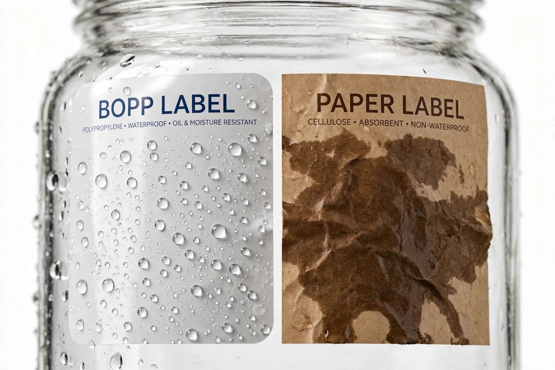
Water droplets beading on a waterproof BOPP label next to a water-stained paper label

If you’re ordering custom labels for the first time, the material question hits you fast: vinyl? BOPP? Paper? Every printer lists them, the prices are all over the place, and the descriptions read like chemistry homework.

Here’s the plain-English version: the material decides whether your label survives its real life — a shower, a fridge, a sweaty hand, a sunny storefront. Pick wrong and a beautiful design peels, smudges, or bleeds within weeks. Pick right and the same design looks great for years.

This waterproof label material guide walks through the three materials small businesses actually choose between — vinyl, BOPP, and paper — so you can order with confidence the first time.

The Short Version

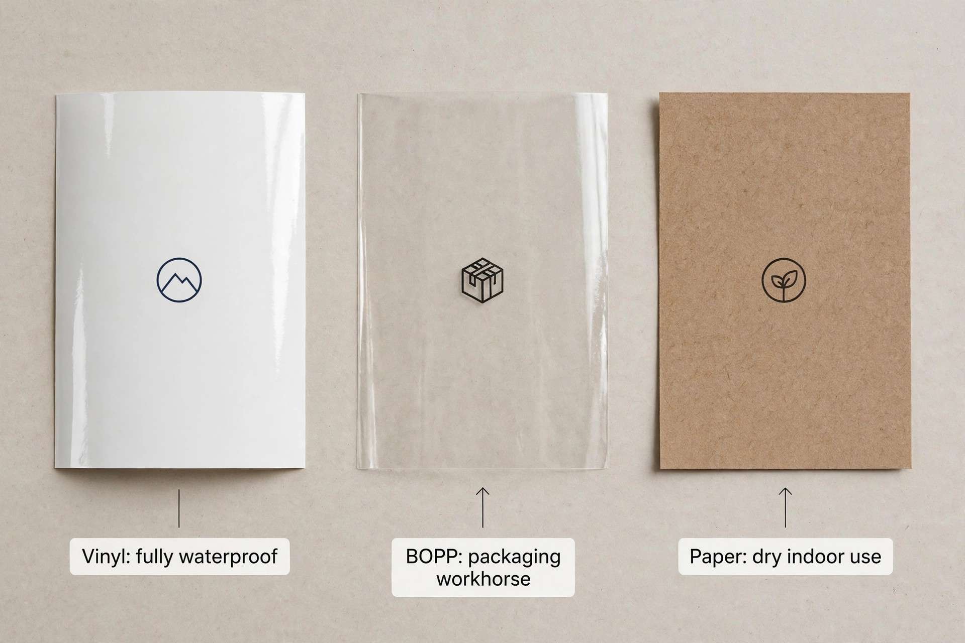
  • Vinyl = the tough, flexible all-rounder. Fully waterproof, sticks to curved surfaces, great outdoors. Costs more.
  • BOPP (biaxially oriented polypropylene) = the waterproof workhorse for product packaging. Handles water, oil, and refrigeration at a lower price than vinyl. Less flexible on tight curves.
  • Paper = the budget-friendly classic. Great for dry, indoor use and premium textures — but it is not waterproof.

If your labels will ever meet water, oil, or refrigeration, shortlist vinyl or BOPP and stop there. If they live indoors on dry packaging, paper may be all you need.

Vinyl Labels: The All-Rounder

Vinyl is a flexible plastic film — the same family of material as car wraps and outdoor decals. It’s the most forgiving label material you can buy:

  • Fully waterproof — rain, sweat, splashes, even full submersion
  • UV resistant — colors hold up in sunlight far longer than paper
  • Flexible — conforms to curved bottles, jars, and tubes without lifting at the edges
  • Tear resistant — hard to rip by accident

The trade-offs: vinyl costs more per label than BOPP or paper, and it’s a thicker material, so it doesn’t give the same “printed directly on the box” feel that premium paper does.

Vinyl labels are ideal for: outdoor products, beverages, health and beauty products used in bathrooms, cleaning products, equipment labels — anything that lives near water or sunshine.

BOPP Labels: The Packaging Workhorse

BOPP (biaxially oriented polypropylene) is a thin plastic film that has quietly become the default label material for consumer packaged goods. If you’ve ever noticed that a shampoo bottle’s label looks perfect even after months in the shower, that was probably BOPP.

  • Waterproof and oil resistant — handles condensation, refrigeration, oils, and greasy fingers
  • Thinner than vinyl — gives a “no-label look” that premium brands love
  • More affordable — typically costs less than vinyl, closer to paper pricing at volume
  • Great print quality — sharp colors, available in white, clear, and metallic finishes

The trade-offs: BOPP is less stretchy than vinyl, so it can lift on very tight curves (think small-diameter tubes), and it isn’t the best pick for extended outdoor sun exposure.

BOPP labels are ideal for: food and beverage packaging, cosmetics and skincare, candles, supplements, pet products — anywhere a label meets water, oil, or a fridge but stays indoors.

Paper Labels: The Budget-Friendly Classic

Paper is exactly what it sounds like — and it’s still the right choice for a huge number of labels:

  • Lowest cost — the cheapest option in almost every quantity
  • Premium textures — kraft, cotton, textured finishes that plastic can’t imitate
  • Writable — ballpoint and marker friendly (handy for price tags and dates)
  • Easy to recycle and compost — the most eco-friendly of the three

The trade-off is the big one: paper is not waterproof. A little humidity is fine; a splash of water, condensation, or an oily finger is not. There are water-resistant paper options with protective coatings, but don’t confuse them with waterproof — a coated paper label survives a brief splash; a vinyl or BOPP label survives a swimming pool.

Paper labels are ideal for: shipping boxes, dry food packaging (tea, coffee bags — not the beans’ moisture, the bag), price tags, mailers, indoor promotional stickers, and anything where the premium feel of kraft or textured stock matters more than water resistance.

Vinyl vs. BOPP vs. Paper: Side-by-Side Comparison

VinylBOPPPaper
WaterproofYes, fullyYesNo (coated = splash-resistant only)
Oil / grease resistantYesYesNo
Refrigeration / freezerYesYesNo
Outdoor / UVExcellentFairPoor
Curved surfacesExcellent (flexible)Good (tight curves may lift)Fair (stiff, can crease)
Look & feelSlightly glossy, durableThin, premium “no-label” lookNatural, textured, classic
WritableNoNoYes
Relative cost$$$$$$
Eco-friendlinessLowLowHigh

The key takeaway: start from the label’s worst day, not its best. Will it ever get wet, oily, or cold? If yes, BOPP (packaging) or vinyl (outdoors/curves). If it lives dry and indoors, paper saves money and can look better. Once the material is set, the next choice is the shape — see our guide on die cut vs. kiss cut stickers to pick the right cut for your design.

Side-by-side comparison of vinyl, BOPP and kraft paper label materials

Which Material for Your Product? Recommendations by Industry

Food, Beverage & Supplements

Default to BOPP. Condensation on a cold drink, oil on a snack bag, a fridge shelf — BOPP handles all of it, and the no-label look suits modern branding. Reserve vinyl for anything sold or used outdoors (farmers’ markets, cooler boxes). Use paper only for dry goods packaging like tea boxes or shipping labels.

Beauty, Skincare & Candles

BOPP is the industry standard here — bathroom humidity, oily fingers, and shower steam are its home turf. Vinyl if the product lives poolside or outdoors. Many handmade brands use paper (kraft especially) for the outer shipping box or hang tag, where the natural texture is part of the brand — just keep it away from the product itself. For candle makers, we go deeper in our guide to waterproof labels for candles.

Clothing & Apparel

Paper wins: hang tags, size stickers, and price labels are dry, indoor items where kraft or textured paper looks premium and costs little. If you need stickers for garment bags that might see rain in transit, that’s a BOPP job.

Household, Cleaning & Outdoor Products

Vinyl, no contest. Chemical splashes, outdoor storage, constant handling — this is what vinyl was made for. BOPP works for indoor cleaning products, but if the bottle might sit in a garage or a sunny window, vinyl’s UV resistance is worth the premium.

Hand applying a BOPP label to a cosmetic jar in a bathroom setting

Frequently Asked Questions

What’s the difference between waterproof and water-resistant labels?

Waterproof means the label survives prolonged water exposure — submersion, rain, dishwashers. Water-resistant means it survives brief contact: a splash, light humidity, a sweaty hand. Vinyl and BOPP are waterproof; coated paper is water-resistant at best. If a supplier says “water-resistant” and you need “waterproof,” ask which material it actually is.

Are BOPP labels really waterproof?

Yes. BOPP is a plastic film — water, oil, and condensation don’t penetrate it. It’s the material behind most waterproof product labels in grocery stores. The one thing to watch: the adhesive and ink matter too. A waterproof film with a water-soluble adhesive can still fail, so confirm with your printer that the full construction (film + ink + adhesive) is rated waterproof.

Can paper labels ever be waterproof?

No — and this is the most expensive misunderstanding in label ordering. Laminated or coated paper resists splashes, but soak it and it fails. If anyone sells you “waterproof paper labels” for a beverage bottle, get the material spec in writing. True waterproofing needs a film: vinyl or BOPP.

Which material is cheapest?

Paper is cheapest, BOPP sits in the middle, vinyl costs the most. But the honest comparison is cost per surviving label: a cheap paper label that has to be reprinted after water damage costs more than a BOPP label ordered once. Quote all three at your actual quantity — the gap between BOPP and paper shrinks fast at volume.

Do vinyl and BOPP labels work on glass and curved bottles?

Yes, with one caveat. Vinyl’s flexibility makes it the safest choice for tight curves and squeeze tubes. BOPP works beautifully on standard bottles and jars; on very small diameters it can lift at the edges over time. For anything under about an inch in diameter, ask your printer — they may recommend vinyl or a specific BOPP adhesive.

How do I know what material my current labels are?

Try the corner test: peel a corner and stretch it gently. Plastic films (vinyl, BOPP) stretch and resist tearing; paper tears immediately. A water drop test also works — on film it beads up; on paper it soaks in within seconds. If you’re reordering from another supplier, bring a sample: a good printer can identify the material on sight.

The Bottom Line

Choosing a label material is really choosing what your label has to survive:

  • Vinyl — maximum toughness: outdoors, water, chemicals, tight curves.
  • BOPP — the packaging sweet spot: waterproof and oil-proof at a sensible price.
  • Paper — dry, indoor, and beautiful: lowest cost with premium texture options.

Start from the harshest thing your label will face, pick the cheapest material that survives it, and you’ll never have to reorder because the labels failed.

Still deciding? Send ZORVOO your product details — what it is, where it’s stored, what it touches — and we’ll recommend the right material, finish, and quantity for your budget, with a free digital proof before anything goes to print.